Valtec’s previous website looked somewhat outdated: it used generic stock videos and images, and icons from different libraries that did not match each other. The heading hierarchy was well planned, but it was hard to notice visually, because it lacked a typeface to support it and clear spacing and color rules. The success stories did not help either: they used stock photos and did not clearly explain each client’s problem or how it was solved.
I started by researching which sections the site needed, how many pages were required and what goal each one served. That led to the complete sitemap: one page per service, a success stories section, About Us, IA Lab Valtec and a blog. With the structure approved in wireframes, I designed the high-fidelity prototypes for Valtec’s development team to take into production.
The challenge
It was not just a matter of aesthetics. Valtec already had a good foundation, a well-planned content hierarchy, but it was not reflected visually. Without a suitable typeface, without spacing and color rules, and with icons from different libraries, the site felt scattered; on top of that, stock photos and videos took away the strength a technology company needs to convey.
The challenge was to build a consistent visual system from scratch (typography, spacing, color and icons) and apply it to a much clearer information architecture, especially in the success stories, which previously did not explain the client’s problem or how Valtec solved it.
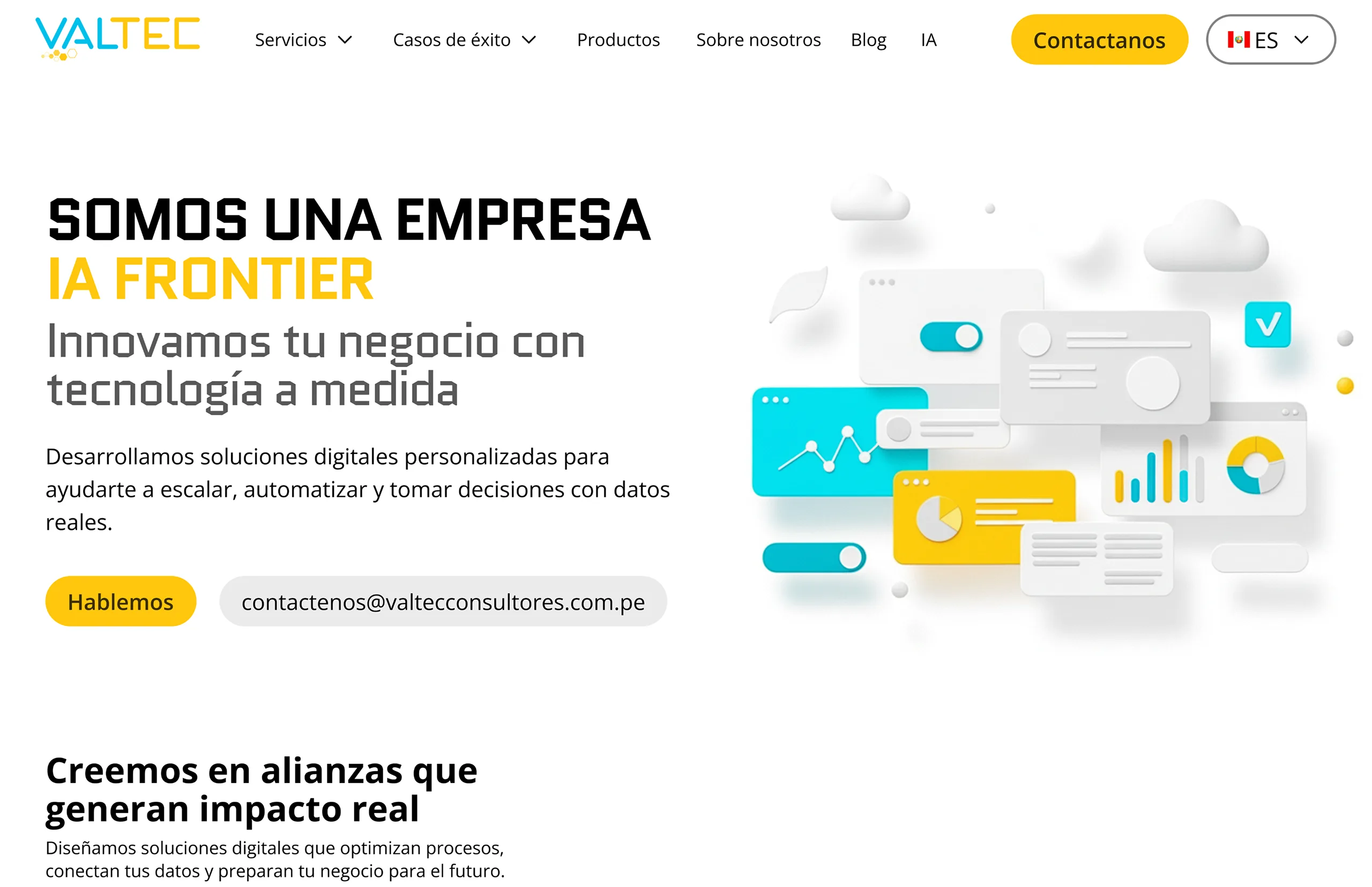
Home
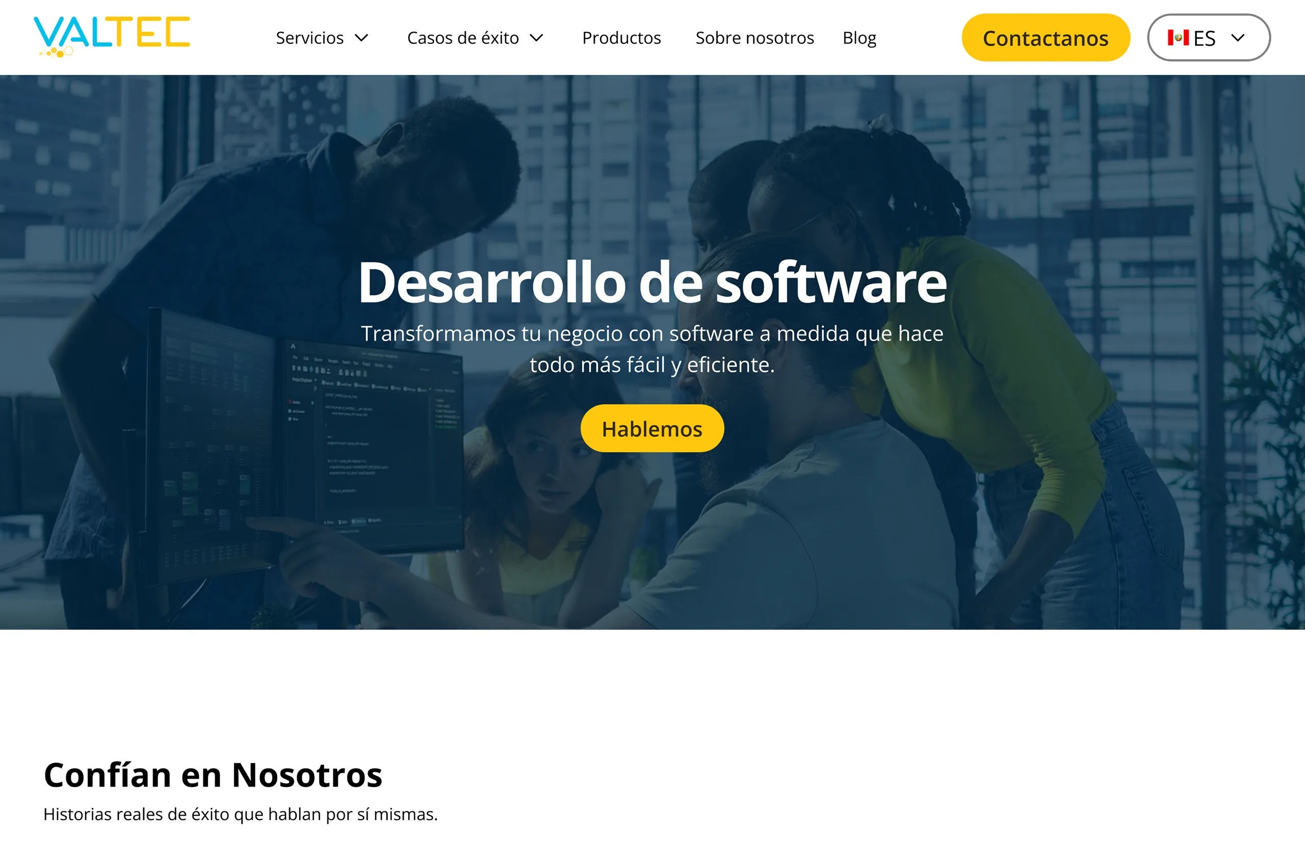
Services
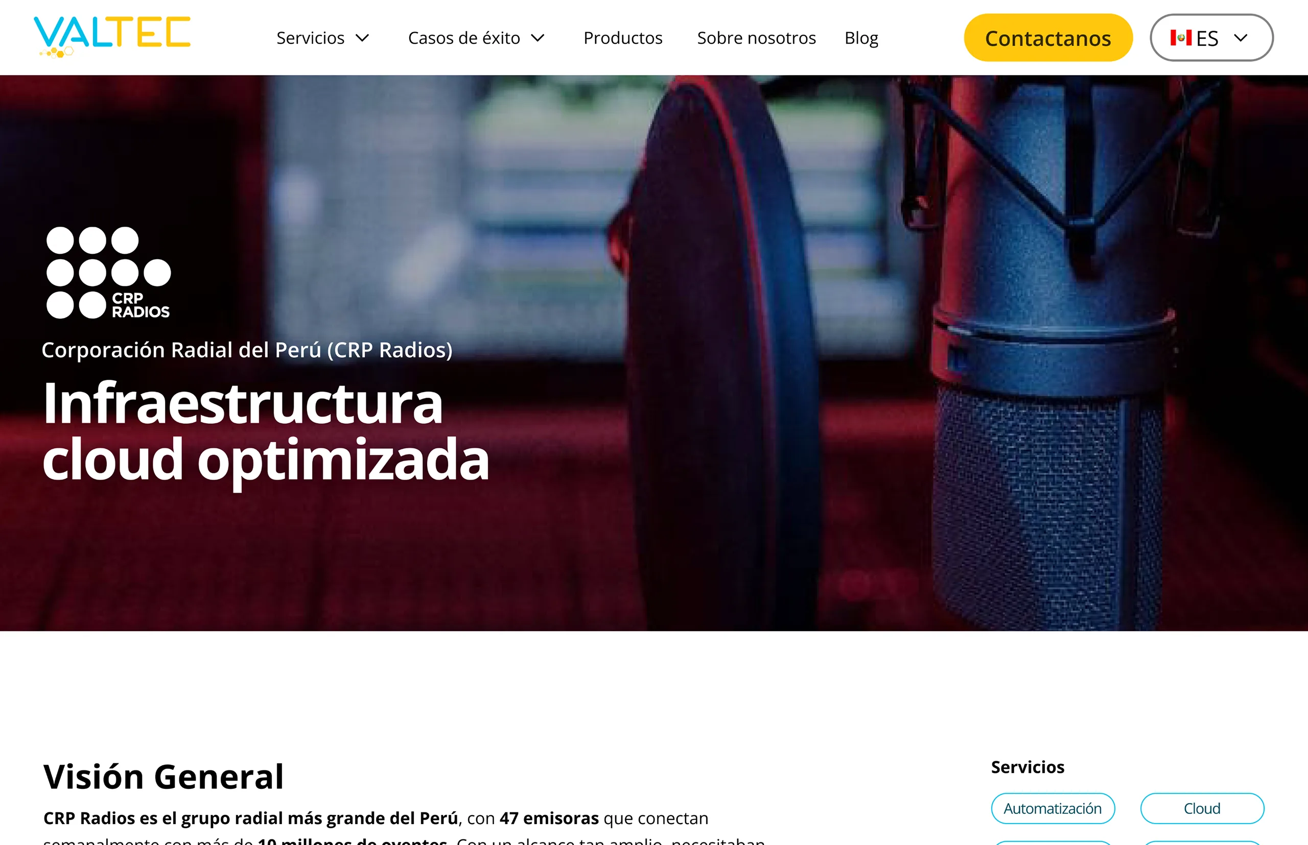
Success Stories
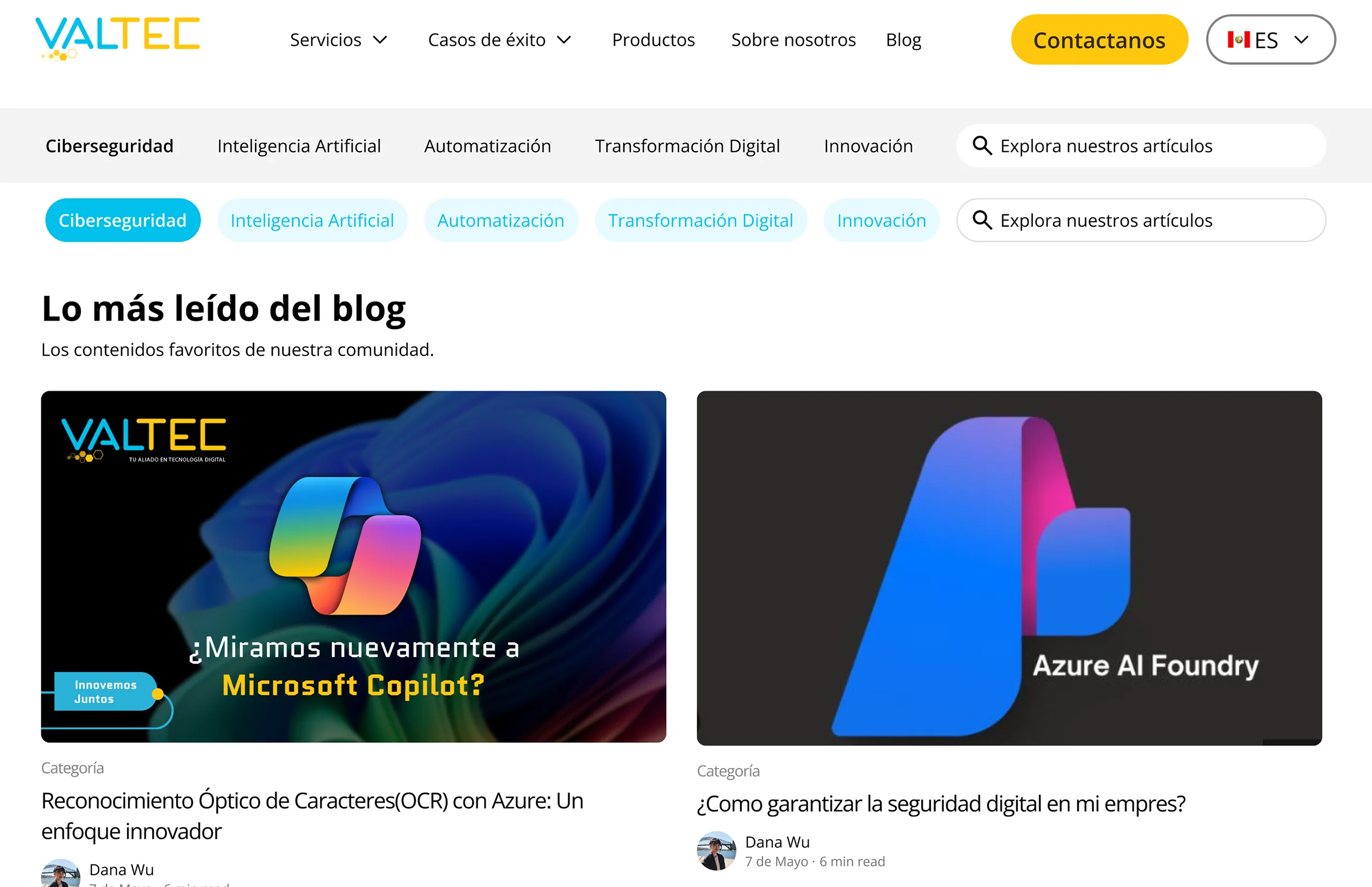
Blog
The home page, with the new visual identity (consistent typography, colors and icons) and access from the menu to every section of the site.
Each service now has its own page, instead of appearing as a simple, undeveloped list.
Each real project clearly explains the client’s problem and how Valtec solved it, something that did not happen before.
A design built for reading, with clear categories. Previously, the typography made the content hard to read.
Clear navigation
The entire site can be navigated from the home page menu, and each page serves a clear goal.
Consistent identity
Typography, spacing, color and icons now follow a single system, instead of being mixed without criteria.
Success stories with real context
Each project explains the problem and the solution, showing the true value of Valtec’s work.
Stronger positioning
A more professional and organized image helps Valtec compete better in its market.