VALTEC
-
Web Redesign
Client frustration was palpable when navigating Valtec’s website, an outdated page with scattered information and visual inconsistencies that failed to reflect professionalism. To transform this reality, Valtec’s website redesign project focused on the user. Through a methodical UX/UI design process, encompassing in-depth research into page-specific pain points and the creation of an intuitive information architecture and cohesive visual identity, a web experience was brought to life that now guides the user with ease, reflecting Valtec’s value with a modern and functional aesthetic.

Where it went wrong
VALTEC’s website, unfortunately, had become a recurring challenge for its users. Being built on a template, the experience was often inconsistent, with key information hidden and hard to find. This generated pain points on every page, from visual inconsistencies in typography and colors, to a confusing information architecture, which prevented VALTEC’s true value proposition from shining through.
This limited foundation not only frustrated users but also restricted the team’s creative and functional freedom, making any update or change a real ordeal. The site was perceived as outdated, which inevitably impacted trust and usability in vital sections such as services, jobs, or contact pages.
How it was fixed
The challenges Valtec’s website faced were palpable for its clients, an outdated page with scattered information and visual inconsistencies that failed to reflect professionalism. To transform this landscape, Valtec’s website redesign project focused on the user. It began with in-depth research into page-specific pain points, directly engaging with stakeholders to understand their challenges and map every friction.
Thus, through the creation of an intuitive information architecture and a cohesive visual identity, a revamped web experience was brought to life. Every element was designed to guide the user with ease, from the logical content layout to the careful selection of colors and typographies. The result is a site that not only boasts a modern and functional aesthetic, but genuinely connects with its audience and clearly reflects Valtec’s value and professionalism.

Core Features
Intuitive Architecture
The site and each page were re-structured for intuitive navigation. Key user questions are now easily answered.Visible Services
The website now quickly displays VALTEC's core services. The value proposition is clear at first glance.Success Stories
A dedicated structure for the company's success stories was included. It highlights the challenge, solution, and real impact.Clear Impact
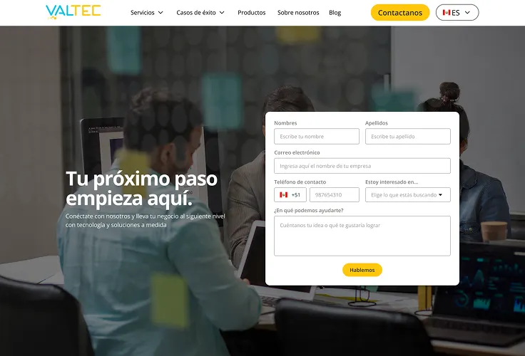
The challenge and VALTEC's solution to clients are clearly presented. Their problem-solving capability is highlighted.Visual Consistency
The website now boasts strong visual consistency. This enhances professionalism and brand coherence.Cohesive Elements
Clear typography, corporate colors, and clean icons/buttons guide the user. This facilitates finding information quickly.Hands-On UX
Understanding the Challenge
In this crucial phase, the goal was to fully immerse in the reality of VALTEC and its users. A strategic conversation was initiated with the project manager to deeply understand the target audience of the website, identifying the language and tone that would best connect with them. Most importantly: specific problems on each page of the existing site were explored, and with equal attention, elements that worked well and should be retained in the redesign were identified.
Furthermore, extensive benchmarking research was conducted on reference pages within the software development sector to analyze best practices and their weaknesses. To ensure the client’s vision materialized, the desired style for the new website was discussed, requesting visual references to guide the aesthetic and functional direction of the project. This immersion ensured that the future design would be aligned with business expectations and real user needs.

Structuring the Foundation
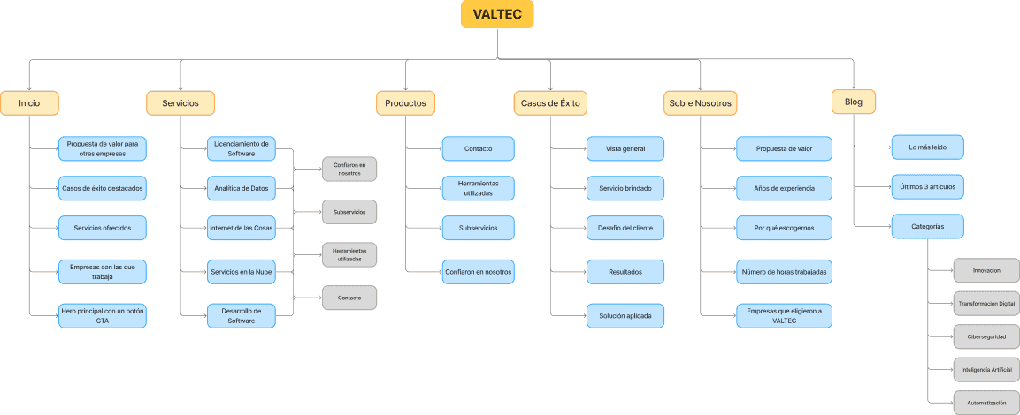
After delving into the needs of the client and their users, the next step was shaping the information structure. Given that VALTEC’s site housed a significant number of success stories, detailed services, and blog articles, the need for impeccable organization became clear. Thus, a comprehensive Site Map for the entire website was built.
This Site Map was articulated into five main categories: Services, Success Stories, Products, Blog, and About Us. Within each of these major sections, a detailed internal structure was defined, ensuring that every piece of content had its logical and accessible place. This process laid a solid and strategic foundation upon which the entire new website would be built, guaranteeing intuitive navigation for the user.
Sketching the Experience
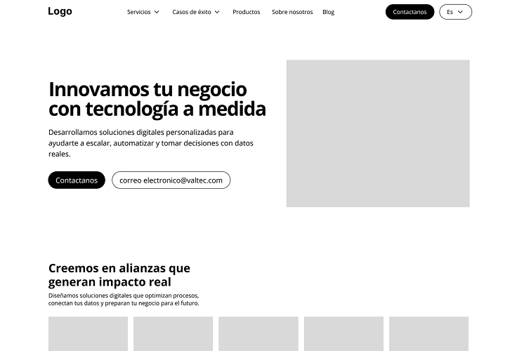
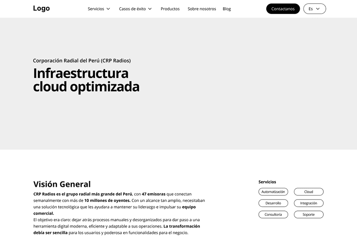
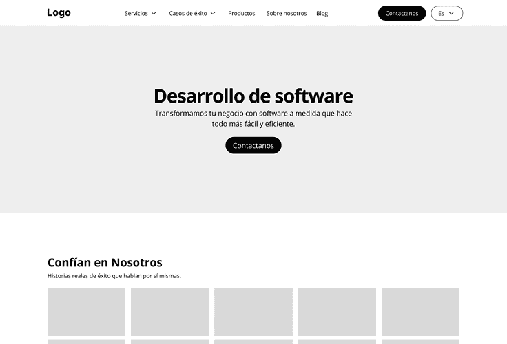
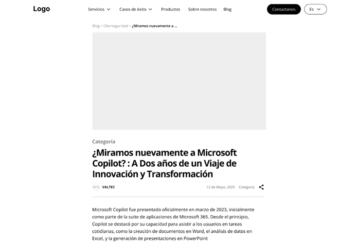
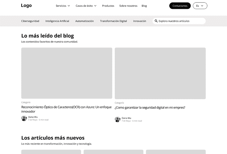
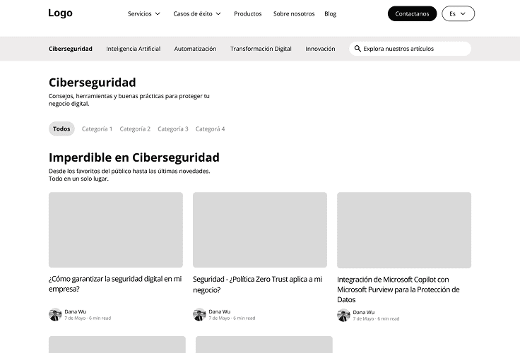
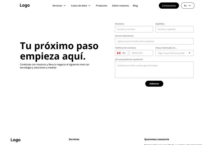
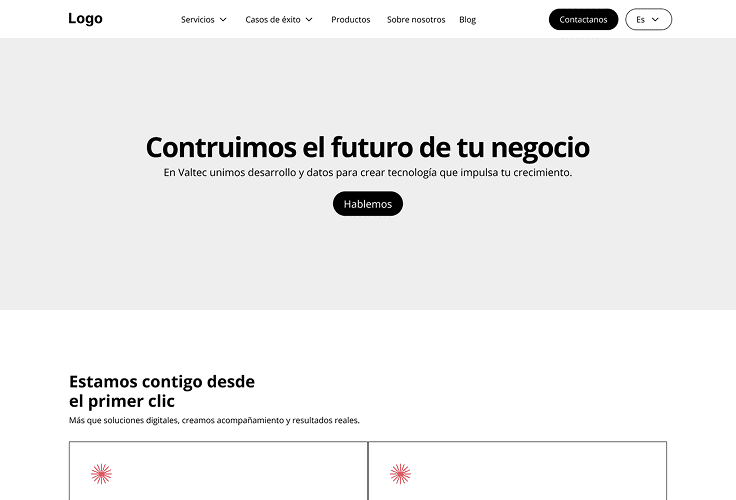
Once the information architecture was solidly defined, the next step was to translate that structure to a more visual level: the site’s wireframes were created. In this phase, the structure of each key page was outlined: from the homepage to the services and success stories pages, not forgetting the design of blog entries and individual articles.
The main goal of these sketches was to facilitate quick and direct client feedback. This allowed for validating whether the organization of elements was as expected, if any section needed to be relocated to improve navigation, or if anything was not entirely clear. This early iteration was crucial to ensure the visual foundation of the website was aligned with business expectations and user needs, before investing resources in high-fidelity design.
Visual Identity
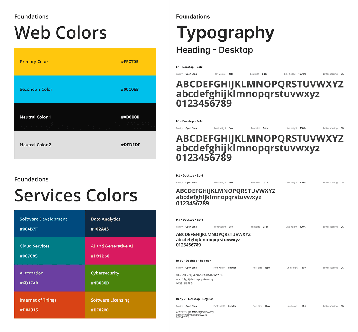
With the structure well-defined, it was time to give personality and visual cohesion to Valtec’s website. A solid visual identity was created: a single icon library (Bootstrap Icons) was selected, and typography and its sizes were precisely defined for the entire text hierarchy (titles, subtitles, labels, and descriptions) in semibold and regular variants.
This foundation was complemented by a strategic use of Valtec’s corporate colors, both on the web and in the selection of tones for primary/secondary buttons and services, ensuring chromatic harmony. For a clean, unified visual experience, AI-generated images using Valtec’s palette were incorporated, making the website feel modern and reliable.
Bringing Design to Life
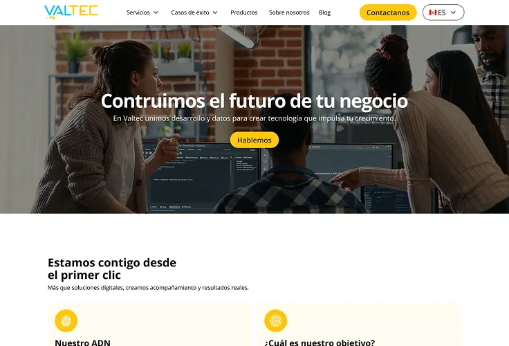
Following the established visual identity and structure, the next major step was to transform everything into a tangible, development-ready experience. The creation of the final prototype in Figma proceeded, where each screen came to life in high fidelity. This included the detailed design of the homepage, services sections, success stories, the blog, and all other key pages.
This prototype was meticulously built following the information architecture and wireframes previously approved by the client. The result was a faithful visual representation, uniting the initial vision with the final visual design, making everything ready for the development phase.
Homepage: The Grand Transformation
Before
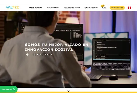
The previous Homepage lacked clear structure or objective. Its videos were slow and it had no consistent visual identity or typography.
After
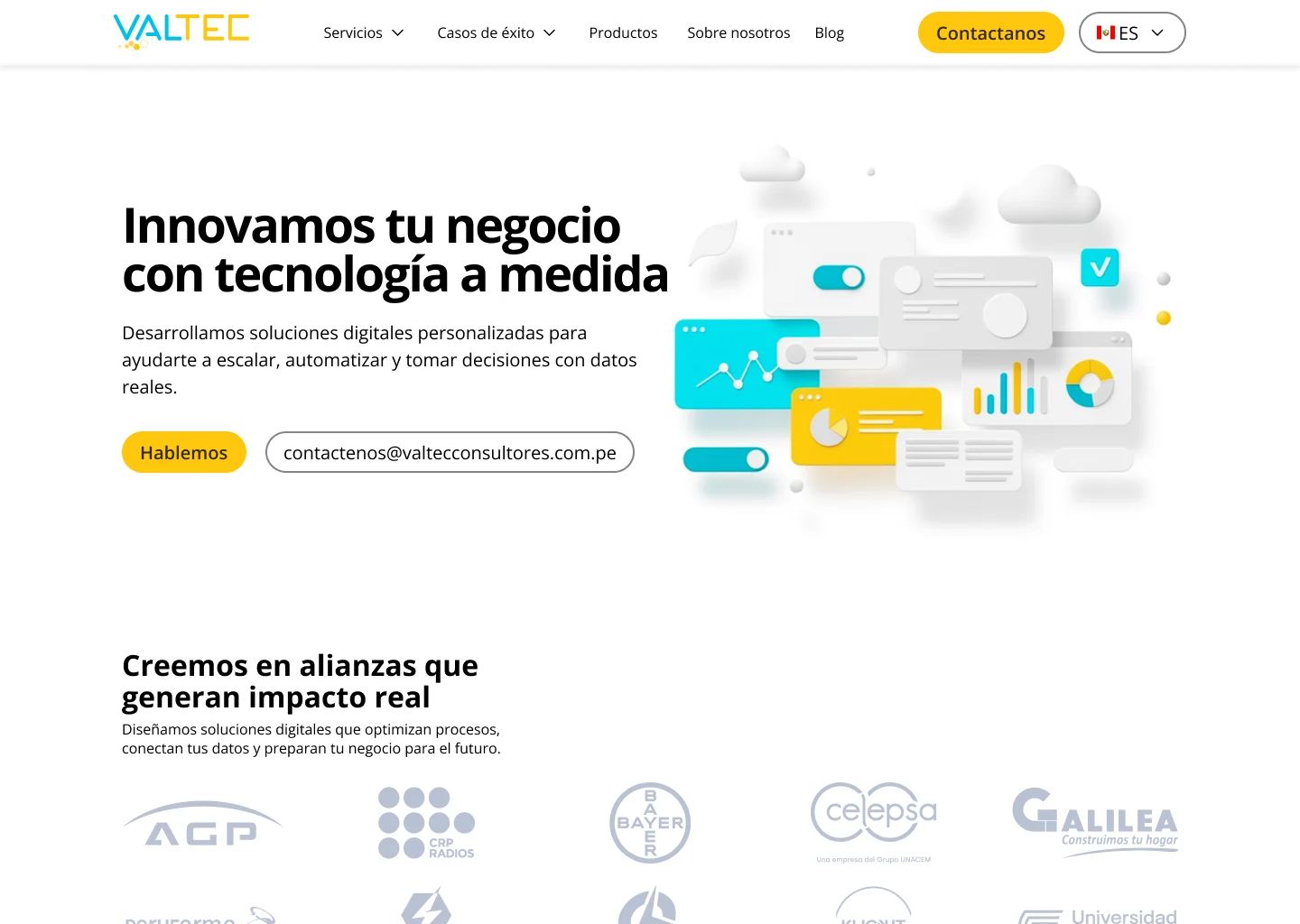
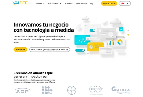
The final proposal features a defined structure and clear visual identity. It includes a direct CTA with a functional contact email.
Services: Value Unveiled
Before
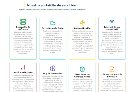
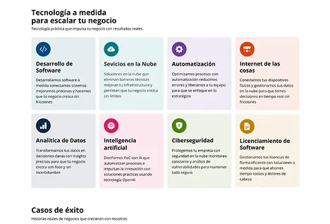
The previous Servicess section showed inconsistent spacing. Its colors were flashy, and icons were incoherent from different libraries.
After
Services section now uses coherent pastel colors aligning with Valtec, avoiding saturation. Icons, from a single Bootstrap library, ensure visual harmony.
Sub-services: Optimized Offerings
Before
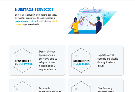
Previous Sub-services section show irrelevant images and unclear texts. Lacked structure, didn’t grab attention or seem like sub-services.
After
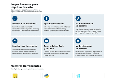
Sub-services section now feature colors and icons consistent with the main service. They include a clear description and an explanatory heading for the section.
Success Stories: Inspiring Journeys
Before
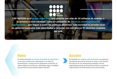
Previous Success Stories displayed extensive descriptions, poor visual contrast. Lacked clear structure of service or client details.
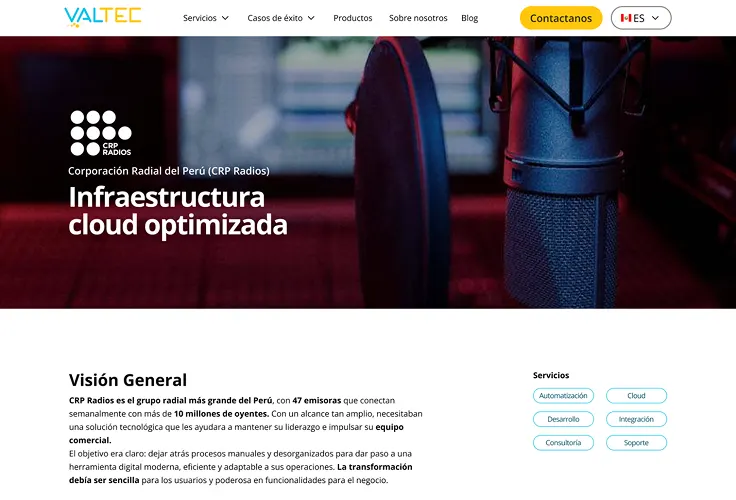
After
Success Stories now feature clear services with tags. The heading shows what was done, and its structure details problem, solution, and how it was done.
Blog: Stories Reimagined
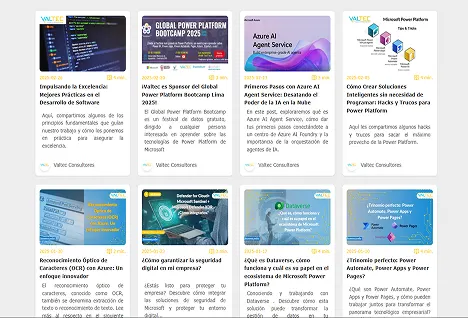
Before
Previous Articles displayed extensive images and descriptions, lacking visual contrast. Their structure was unclear regarding solution or client.
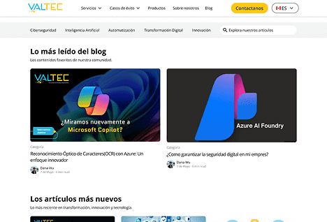
After
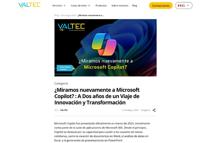
Articles now clear, organized. Hierarchical typography and colors. Show date, author, category. Clean design.
Articles: Engaging Content
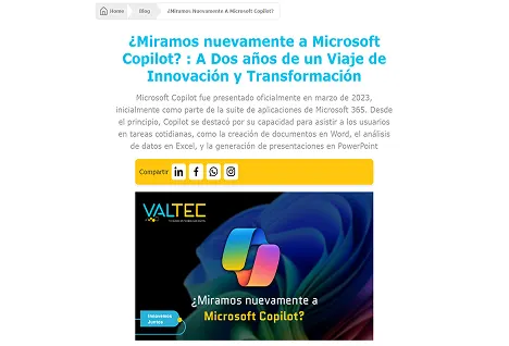
Before
Previous Articles displayed inconsistent typography, excessive colors. Unclear text, no spacing, affecting usability.
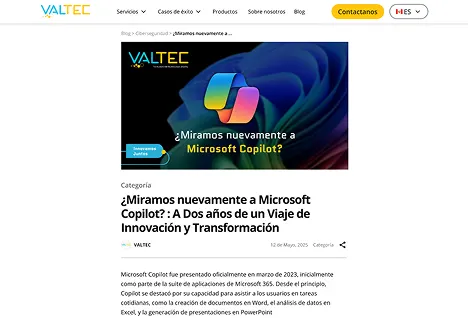
After
Redesigned Articles display clear image. Colors only on buttons. Feature defined structure with clear typography and weights.
Different challenges, same drive
