RockStar Data
-
Nightlife Data SaaS
The frustration of nightclub and restaurant leaders is palpable as they navigate a sea of scattered data with no clear direction. For them, Rockstar Data was designed, a Business Intelligence SaaS platform that transforms that chaos into a crystal-clear vision. Thanks to a user-centered design, intuitive, role-specific dashboards were created, turning complex information into visually impactful insights. Now, making strategic decisions is a clear, confident path, empowering every leader to optimize resources and and skyrocket growth.
Where it went wrong
Imagine running a nightclub or restaurant chain in Spain. Your business generates tons of data, but information is scattered everywhere (Excel, Forvenues, Premium Guest). This turns a weekly report into a real headache, like having puzzle pieces with no idea how they fit. Manually managing everything leads to very common errors, losing track of sales or data. In such a high-stakes industry, it’s frustrating not knowing where to invest or save.
This lack of a clear, reliable overview makes strategic decision-making feel like a blind guess for the CEO, purchasing manager, floor manager, human resources, or marketing team. It’s crucial to transform this data complexity into actionable clarity, ensuring each role has precise information to drive business success.
How it was fixed
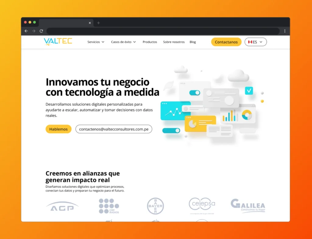
Facing a website perceived as outdated and with visual inconsistencies that frustrated users, a strategic, user-centered redesign was initiated. The first crucial step was to identify specific pain points users encountered while navigating each page, aiming to understand what made the interaction confusing or incomplete. This allowed design efforts to be focused precisely where they were most needed.
The solution began to take shape by defining a more intuitive structure and clear information architecture. The goal was to transform the perception of a template-limited site into a professional, cohesive platform. The aim was for every section, from projects to services, to naturally guide the user, ensuring important information was easy to find and the site reflected Valtec’s professionalism and value.
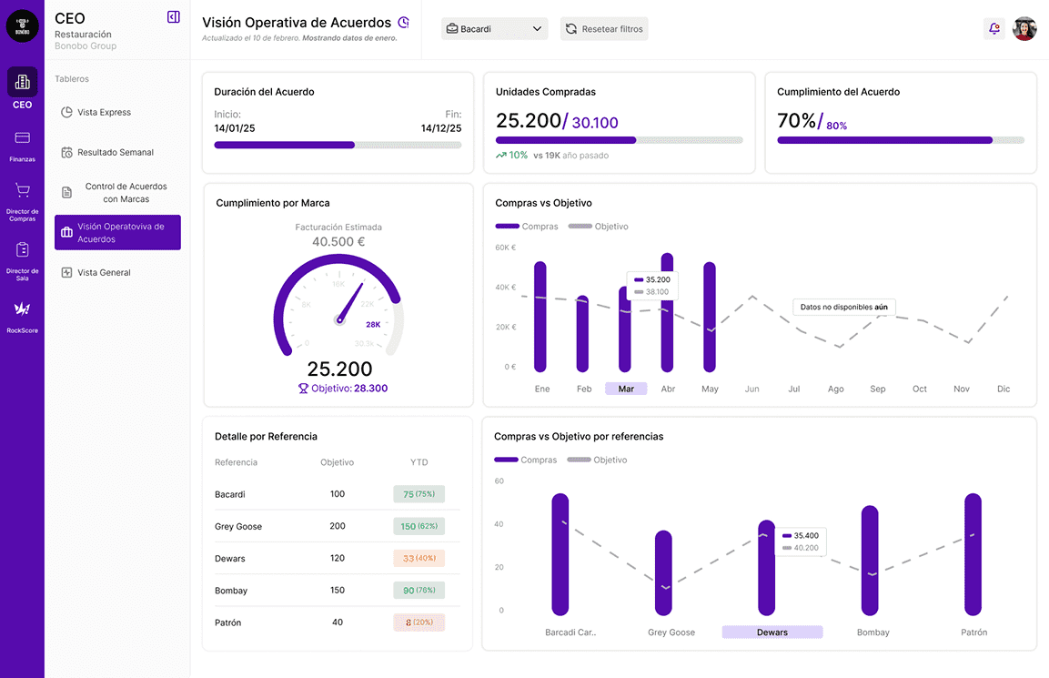
Core Features
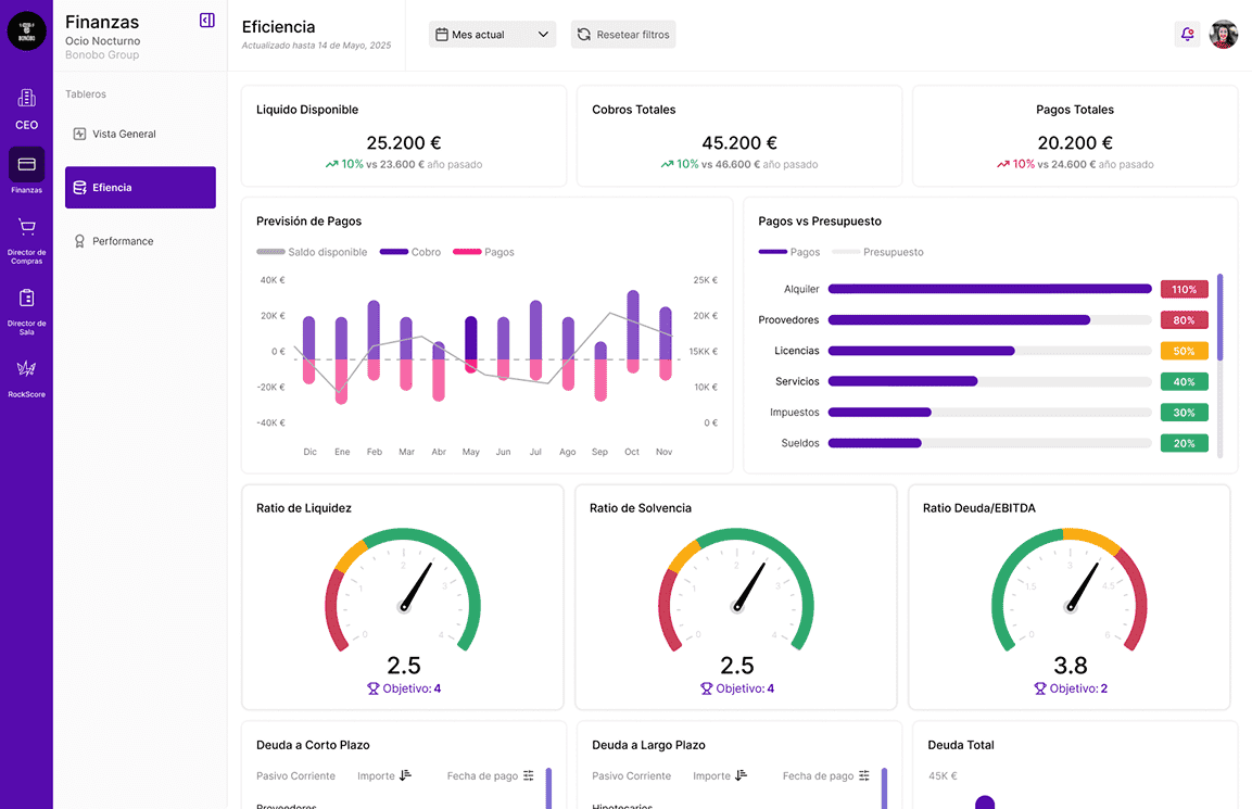
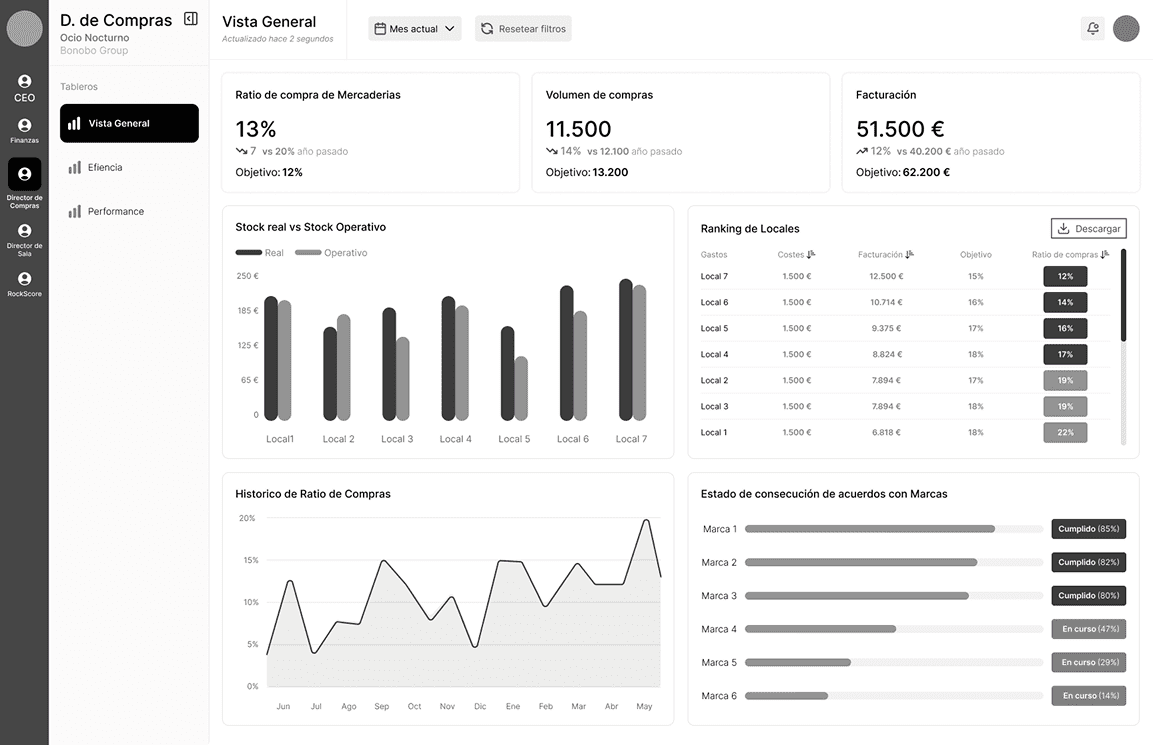
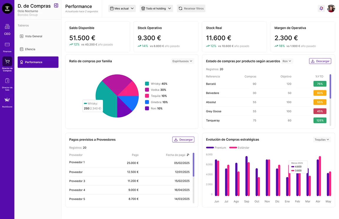
Total Unification
Centralizes all data platforms in one place, providing a clear and complete overview.Up-to-Date Data
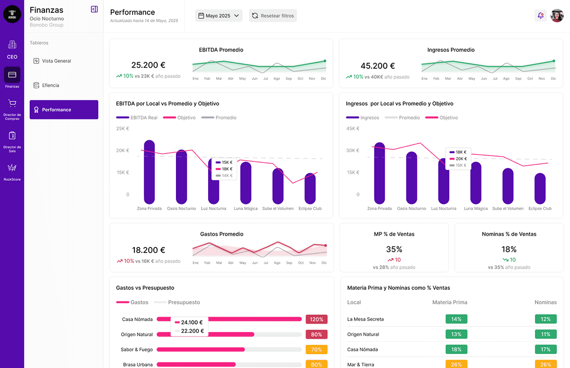
Instant access to daily event, income, expense data. Speeds decisions, based on latest reality.Clear Goals
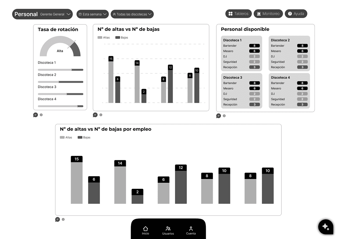
Facilitates setting and monitoring weekly, monthly, annual goals. Helps measure success.Custom Dashboards
Personalized dashboards by role, showing only crucial info. Avoids overload, optimizes focus.Clear Visuals
Presents complex data in easy-to-understand charts. Transforms numbers into clear stories.Key Trends
Visualizes historical performance and projects future trends. Facilitates strategic planning.Hands-On UX
I am a heading
Understanding Their World
In this crucial initial phase, efforts were focused on thoroughly understanding the world of nightlife and hospitality. Research was conducted into how these businesses generally operate, utilizing secondary research and benchmarking of similar platforms to identify their weaknesses and strengths. Existing software and tools were also analyzed in detail. The goal was to understand the current digital “ecosystem” and its challenges.
Then, the real magic happened with in-depth interviews with the managers of each area. Active listening was employed to understand their current processes, pain points, and most tedious tasks. Their ideal process was outlined, and the most valuable features of their tools were uncovered. This immersion allowed for deep empathy with users and validation of business needs, laying the groundwork for a solution that truly solved their problems.

Defining Our Users
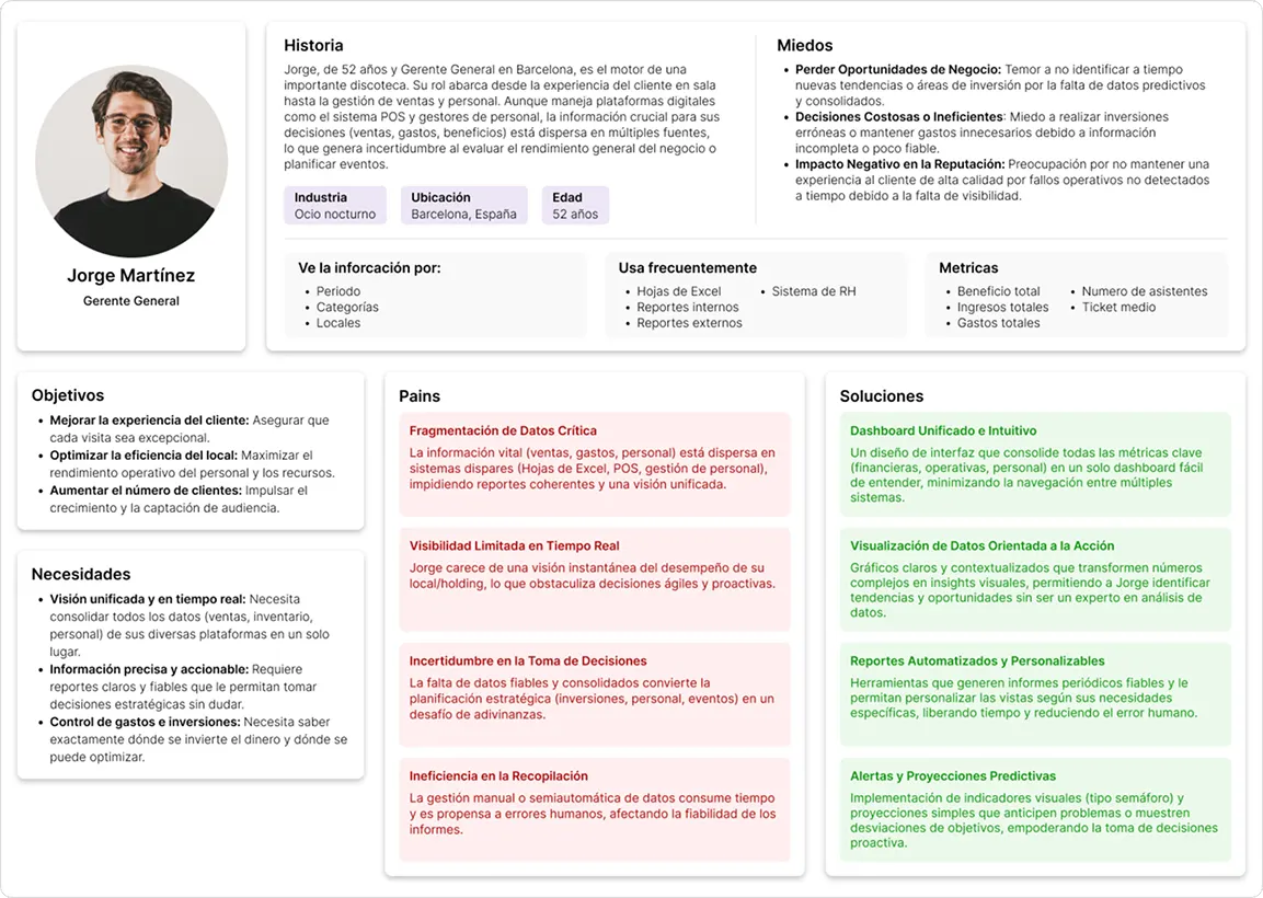
Following the initial research, it became clear that each role within the companies faced its own unique challenges. Therefore, User Personas were created for each key figure, such as the CEO, Purchasing Director, or Floor Manager. It was identified that, while all grappled with data complexity, their pain points and needs varied significantly across different stages of the process. What was data disorganization for one role, might be data timeliness or inaccessibility for another.
For each of the 5 User Personas developed, their specific goals, primary needs, and most pressing pain points were documented. This detailed segmentation was crucial for deeply empathizing with each user type and ensuring that future design solutions were directly aligned with their realities and expectations, avoiding generic approaches.
Orchestrating the Journey
With User Personas clearly defined, the next step involved diving into the full customer experience from the user’s perspective. A detailed Customer Journey Map was designed, covering the process from role assignment to the creation of the first objective. The goal was to identify the most significant pain points and frictions that caused stress or discomfort.
This mapping revealed crucial opportunities for flow optimization. It was discovered that, for the Minimum Viable Product (MVP), certain processes were not essential and could, in fact, be eliminated to reduce user cognitive load and ensure a simpler, smoother experience. This strategic simplification ensured the final product would be intuitive and highly efficient, focused on solving the most critical problems without overwhelming users.
Structuring the Interface
With user needs and pain points clearly defined, the next stage involved giving visual form to the ideas. Here, the solution to the problem began to take shape. Initial low-fidelity, black-and-white interface sketches (wireframes) were created. These allowed for defining the information architecture, organizing key elements, and determining the layout of graphs and specific functionalities for each role.
This low-fidelity approach proved crucial. It enabled agile manipulation of designs, allowing for rapid and valuable iterations without concerns about visual details like colors or spacing. The primary goal was to validate the fundamental structure and information flow, ensuring the product’s foundation was solid before investing time in aesthetic refinements.

High-Fidelity Experience
With well-defined structure, information architecture, and user flows, the next step was to bring the design to life with a high-fidelity functional prototype. This allowed for validating the interaction design and observing how end-users truly behaved, ensuring functions were clear, intuitive, and met their expectations.
In this phase, a comprehensive design system was also created. Final colors and typography were chosen, applying spacing rules and visual hierarchy. A library of reusable graphics, icons, and components was established to ensure consistency throughout the interface. Careful copywriting and strategic color usage (60-30-10 rule) ensured the interface was not only appealing but also extremely clear and usable.
Results

Operational Clarity
Data complexity was transformed into a unified, accessible view. Users now navigate crucial information with ease and confidence. This design optimized their experience, enabling instant insights.
Empowered Decisions
Previously scattered information is now available in dashboards that facilitate agile, more confident strategic decisions for every role. This empowers leaders with the control and confidence needed to act.

Validated Experience
High-fidelity prototype testing confirmed high user satisfaction, validating that the intuitive design solves their real needs. This ensured the product was not only useful, but also delightful to use.
Value Confirmed
The project generated significant from potential clients, demonstrating the clear value and market relevance of the implemented design. This proved how strategic design directly drives commercial success.
Different challenges, same drive